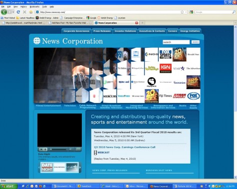
The parent company behind the controversial FOX News is an interesting website study.
First, there’s the question of, “what sort of website do you create when your company is so big and unwieldy that it’s tough to decide what the focus is.
The Answer: everything or nothing. Depending on the company, one answer may make more sense than the other, but the reality should come back to the age old question: “who is your audience?” Or at least “who do you want your audience to be?”
NewsCorp’s answer is, “everything to everyone.” On a website, that’s extremely difficult to do well.
So how do you go about being everything to everyone? You fill the home page with copy or you rotate messages. Newscorp has chosen the latter. It leads me to a trend I’ve noticed that most companies are gearing toward: The flash banner home page. The flash banner home page essentially looks like this. The first thing the user sees is a full length, half-screen flash movie that rotates various messages in and out. It’s not new or revolutionary, but it’s quietly becoming the standard website template. And, honestly, it seems to work, depending on the execution.
In NewsCorp, case, I think the execution has a cool factor, but after a while, it simply hypnotizes the reader to forget the rest of the page. It shows all of its subsidiaries, followed by a huge advertising for one of them, from a particular show to events. Then it has a Q-bert type transition back to the subsidiaries. The transition goes so fast that it’s hard to figure out what you’re seeing. The other part of this execution that’s almost unforgivable is that the space is unclickable. It takes up have the page and does absolutely nothing except act as a giant billboard. I’m not one to say things like this, but that is soooooo 1998. If you want a giant billboard for your website, go back to a time when that’s all they were good for. As a result of the billboard, the navigation is stuffed all around it, with holding company type navigation at the top and the entertainment promotion underneath. Because of where the eye goes, the holding company nav is largely ignored. Underneath, they list the latest media and PR about the company and a token nod to social media.
Maybe it’s an identity crisis, but a holding company needs to decide who it is and who it’s talking to. Then keep the same face in all of its media.
