Be prepared. I’m goin’ worldwide ya’ll.
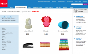
My new favorite web site is the one for HEMA department store. If you’ve never heard of it, then you mostly likely haven’t been to Holland. It’s the Dutch version of Kohls or maybe Target.
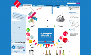
HEMA’s web site is an old viral friend to many of us in the business. I personally have received it at least three different times. I was delighted to see that it was different each time. Okay, so “delighted” was probably not the word, but I thought it was pretty cool.
Not impressed? See it for yourself.
Still not impressed? Too bad for you. Either I’m easily amused or you’re in the small humorless minority. Either way, it’s a great use of flash.
Most sites focus too much on the conceptual aspect of the site. As an advertising guy, I’m probably guilty of this too at times. this site leads you up and down the page, leading you through ALL of the products (unbeknownst to you) while amusing you all the while. Few people I know have resisted watching it at least once more. Most reload again and again and discover something different. You can’t buy that kind of traffic….can you?
The one drawback: you can’t order products from the department store’s web site. You have to go into the store.
Small glitch.

