Stephen Snell at DesignMag did me a huge favor a week ago: he put together a list of the web sites of the Fortune 100.
First, let’s look at what the heck the Fortune 500 is. Well, according to those in the know at USPages.com, it was started in 1955 as a list compiled by Fortune magazine raking the top 500 public corporations of the US as measured by their gross revenue. Okay, so it’s not a popularity contest like some of those lists like “the top 10 companies to work for” or “the best companies for people with pets,” etc. etc. It’s a legitimate tally of the companies making the most money, or legitimately financial like that.
As a side note, when I was looking up Fortune’s history, I saw that it was started in 1929, the year of the great stock market crash, at a full $1 an issue. Genius thinking boys. Now that’s a set of golf balls. A CNN article claims they sent a memo saying they wouldn’t be “overly optimistic.” Uh, yeah.
Anyways, back to our main goal here. I’ve decided to take on the Fortune 100 – no, not their bevvy of lawyers- just their web sites. After all, people do love lists. By logic standards, they higher we go up, the better the design, usability and richness of content should be.
So, thanks, Stephen and here goes:
#100
3M
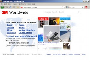
Okay, so we start out a little slow here: We get a selector page with verdana bold and a photo collage from 1998. Not horrible. Clean and simple, just a little dated.

On to the main course.
First impression: better than the landing page. Basic, clean, tech-like nav with an update-able main staging area. Interestig sci-fi graphics, but then we hit the snag.

I predict we’re going to start seeing a pattern here. As with most multi-departmental web sites, there’s a fight for real estate on the home page. Like George Orwell said, “some animals are more equal than others.”
So we’ve got this home page with a products and services link the navigation. Great. Simple and to the point. If you go to the products and services section, you get every 3M product ever created. But wait- don’t click yet, because we’ve got this other products and services link on the left below it with a shorter list of products.
At first, it looks like a neat categorization that make a otherwise unruly list of products unmanageable. Actually, it is. Pretty helpful and certainly easier than going to a page full of text links.
Good for them…but wait!
Not all of the products are listed under those categories. What they’re really saying is, these are our most profitable (or if they’re feeling customer service-y their most popular) products.
Okay, so I shouldn’t be nitpicky. Not everyone comes to 3M’s site to find out about their pet care stuff.
But then here comes another real estate showdown. Because people don’t know products by the category- they need to see brands, like post-it! So now we have a “Brands” tab right next to a “products and services” tab.
Huh?
“Hey, and did we mention our brands? Just in case you don’t know wat brands means, you can go to the bottom of the page, and we have another link to our brands, as well as pictures of our four favorites.”
Where some of the most important information is, can be found in the “attack of the sideways scroll bars” section in the center of the page where you can actually buy stuff. That’s right- the company can make money here on this small link in the center of the page, right next to the giant NASCAR sponsorship.
It’s all about image, right?
Design, okay, navigation FAIL.
3 responses to “The Fortune 100: Throwing money at stuff since 1955.”
Thanks for mentioning my post. I thought it would be interesting to look at sites of the largest companies in the world, and the results were pretty much what I expected. Most left a lot of room for improvement.
[…] dfwbrett is a certifiable web expert by his own declaration. All site reviews are purely for entertainment, editorial and informational purposes. If you’d like your site reviewed, contact us. « The Fortune 100: Throwing money at stuff since 1955. […]
[…] put money into a full fledged interactive plan. You’d think, though, as I mentioned in my first Fortune 100 post, that the Fortune 100 would a) have enough money to through money at it, or b) Have enough people […]